Oil, Watercolour or Pastel for a Western Landscape?
Compare oil, watercolour, and pastel for a Western landscape by seeing how each medium handles edges, layers, and surface, then choose what suits your subject.
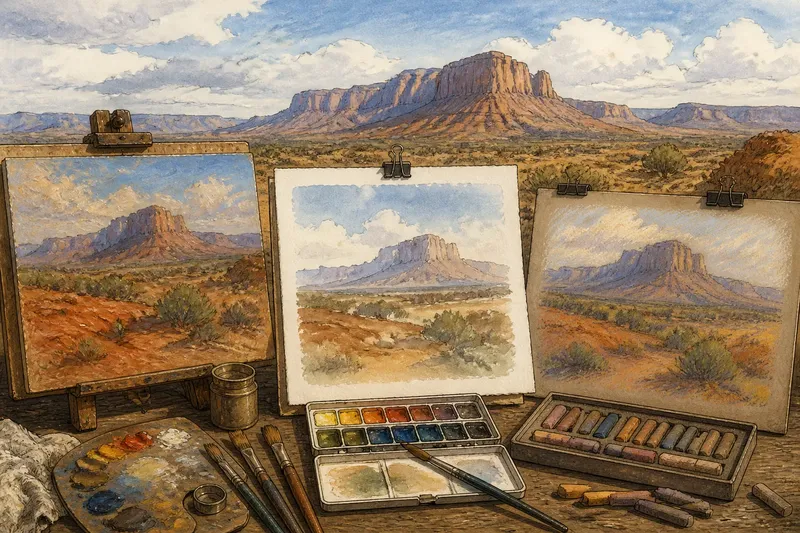
Which medium will make the edges, layers, and surface of a Western landscape read the way you want? Oil, watercolour, and pastel each solve a different set of painting problems. Oil can keep a hard edge crisp beside a soft one; watercolour lets transparent layers carry light; pastel puts color directly on the surface, where its marks remain visible.
Those differences matter in subjects such as a distant mesa, a dry wash, or scrub scattered across open ground. Rather than ranking the media, look at what is going wrong on the page or canvas. Then consider what the material can do—and what you can change without fighting it.
Edges that feel stiff
A ridge can look cut out when every boundary is equally sharp. The cause may be a habit of outlining each shape, but the medium can make that habit easier or harder to correct.
With oil, a firm brush and a decisive stroke can create a clear silhouette. If too many edges stay hard, soften selected stretches by gently working a clean, dry brush across the boundary or laying a neighboring color against it. Keep the most definite edge where a rock face meets bright sky, then let the ridge lose clarity where it recedes.
Watercolour edges often follow the movement of water. A wet wash can bloom beyond its intended boundary, while a dry brush on dry paper can leave a more controlled mark. If a foothill spreads into the sky, pause and let the paper dry before adding another shape; trying to correct a wet wash at once can leave a muddy patch.
Pastel makes it easy to place a sharply colored mark, especially with a firm stick. If every shrub and ridge has a bright outline, use a finger, blending stump, or soft brush to soften only a few boundaries. Leave some broken marks visible so the landscape does not become uniformly blurred.
Layers turning muddy
Color can lose its freshness when too many layers mix together. In oil, repeated brushing over a partly worked area can blend distinct colors into a duller one. Try placing the next color with a clean brush and fewer strokes, or leave the underlayer visible as part of the surface.
Watercolour can become cloudy when a brush repeatedly disturbs a layer that is not dry. Let each wash dry before adding a more defined ridge, shadow, or bank. Transparent layering can then build depth without covering the paper’s light. If a wash has already become uneven, consider letting it dry and working with the pattern that remains instead of scrubbing at it.
Pastel layers can cover one another until the tooth of the paper no longer holds fresh pigment. Use a lighter touch, or switch to a less soft stick for the next mark. A colored ground can show through thin passages and connect scattered marks without adding another heavy layer.
Imagine you want to show rust-red earth below a pale blue mountain. With watercolour, you might let a light blue wash dry, then add a thin earth-colored foreground. In oil, you could place the foreground color beside the mountain and soften their boundary selectively. In pastel, a light blue ground with broken red marks left visible may keep the two areas distinct. The choice changes how the layers meet, not which scene is more faithful.
Surfaces hiding the subject
Surface texture can help describe a place, but it can also compete with its larger shapes. Canvas weave may interrupt a smooth oil passage. Watercolour paper’s texture can catch a dry brush and make a ridge look speckled. Pastel paper’s tooth can break a mark into visible flecks.
For oil, a smoother ground may suit a broad, quiet sky, while canvas texture can contribute to rough rock or scrub. If the weave shows through more than intended, use a more fluid paint passage or choose a prepared surface that suits the finish you want.
For watercolour, paper texture is part of the mark. A rough sheet can make dry-brush details lively, while a smoother sheet may support cleaner small shapes. If a distant slope looks too busy, use a more even wash and save broken strokes for nearer ground.
For pastel, paper tooth affects how much pigment a surface can hold. A smooth sheet can make fine lines easier, but it may not accept many layers. A more textured or prepared surface can retain more marks, though it can also make delicate passages harder to control.
Choosing by subject?
Which medium suits broad skies?
Watercolour can carry an open sky in a transparent wash, while oil can keep the sky and land in distinct, adjustable passages. Pastel is useful when you want visible strokes or a dry, matte-looking field of color.
Which medium keeps distant forms quiet?
Watercolour can soften a far ridge with a light wash and an unforced edge. Oil can blur or mute a boundary while preserving a broad color shape, and pastel can keep distant forms simple by using fewer, lighter marks.
Which medium handles visible ground texture?
Pastel places marks directly on the surface, so broken color can suggest gravel, scrub, or dry grass without hiding every bit of the ground. Watercolour can use paper texture and dry-brush marks, while oil can build texture through the paint itself.
Can you combine these media?
Some artists use pastel over a dry watercolour underpainting, but compatibility depends on the materials and surface. Check the manufacturer’s instructions for the specific products before combining them.
When the result feels flat
A scene may feel flat even when its colors seem plausible. One common cause is treating every part of the land with the same edge and detail. Try assigning different jobs: a crisp near edge, a broken middle-distance contour, and a quieter far ridge.
Each medium offers a way to make that shift. Oil lets you adjust a boundary with neighboring color. Watercolour can preserve a pale wash for distance and reserve stronger marks for nearer forms. Pastel can make near details more varied while leaving distant shapes spare.
If the surface still feels crowded, remove attention rather than adding more marks. In oil, soften a distracting contour. In watercolour, let a wash stand without another pass. In pastel, stop before every patch has been covered. Those choices leave room for the viewer to read the land as land, rather than as a catalog of textures.
A useful choice
For a Western landscape, start with the quality you want to control: crisp boundaries, transparent layers, or visible surface marks. Oil, watercolour, and pastel each offer a different route through those decisions, and a change of medium is not a fix for every painting problem. If a distant mesa needs a quieter edge or a dry wash needs more broken texture, choose the material whose natural marks help you make that adjustment.
When comparing oil, watercolour, or pastel for a Western landscape, keep the subject and the surface in view together. A broad sky may benefit from a transparent wash; a rocky slope may invite broken pastel marks; a boundary that needs selective softening may suit oil. The useful question is not which medium wins, but which one lets the landscape’s important edges, layers, and textures speak clearly.