The West Is Not One Visual Style
The West is not one visual style: learn to read regional art through place, community, materials, and choices that broad labels can conceal.
Why can two paintings both be called “Western art” and look as if they belong to different worlds? The West is not one visual style: the label gathers work shaped by distinct places, communities, histories, and artistic decisions. Looking closely at those differences makes the category more useful—and less likely to flatten the people and landscapes it describes.
What does “Western art” mean?
“Western art” can refer broadly to art made in or associated with the western United States, but it does not name a fixed set of visual traits. A painting of a high desert, a coastal town, or a working ranch may share a regional label without sharing a subject, audience, or way of seeing.
The phrase can also carry different meanings in different settings. A museum might use it to organize a collection; a gallery might use it to help visitors find landscape painting; an artist might resist it because the label makes a varied practice sound narrow. Ask who is using the term and what it is meant to connect.
Geography alone rarely explains an artwork. A place has its own light, weather, building materials, industries, and patterns of settlement. Yet artists also bring personal histories, cultural affiliations, training, and intentions. The result cannot be reduced to a regional checklist.
Why does the West seem to have one look?
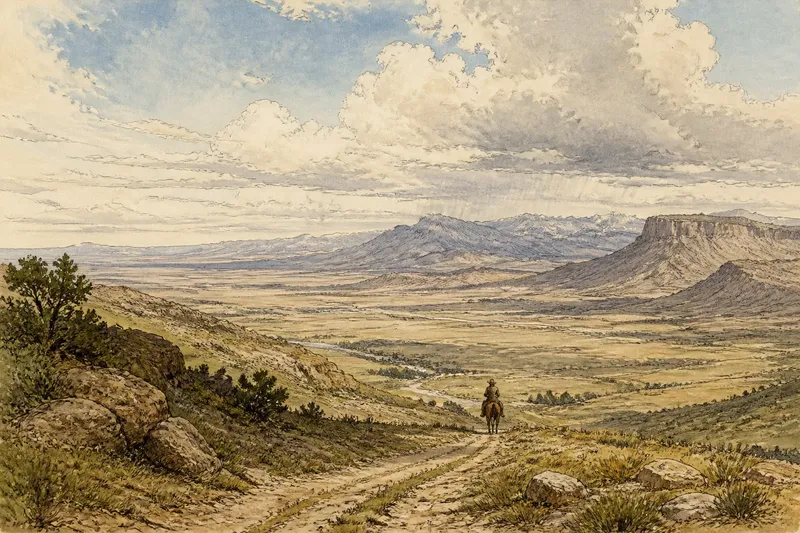
Familiar images can become shorthand. Monumental rock formations, open skies, horses, and distant mountains appear so often in popular depictions that viewers may begin to treat them as the region itself. Those subjects are real, but they represent only part of a large and varied place.
Repetition also comes from how art is presented. A gallery wall or book section arranged under one broad label can make neighboring works seem more alike than they are. Captions and promotional language may emphasize a shared setting while saying little about the artists’ different purposes.
Even a recognizable motif changes meaning from one work to another. A road might suggest access, labor, isolation, tourism, or the edge of a growing town. The setting offers a clue; the artist’s choices and the details in the work help clarify what that clue is doing.
How do regional labels hide differences?
A regional label can make a work easier to find, but it can also blur distinctions between rural and urban life, Indigenous and settler perspectives, industrial and agricultural settings, or long-established communities and places shaped by recent migration. None of those pairings describes a simple split. They point to differences a broad label may leave unexplained.
There is also a difference between art made in a place and art that presents an idea of that place. A studio artist may work from photographs, memory, or research. Another may make work within a community and address its everyday concerns. The location named in a caption does not, by itself, tell you which relationship is present.
Notice whose presence is visible and whose is left outside the frame. A landscape without buildings can still reflect choices about land use and belonging. A street scene can show which people the artist centers, which activities receive attention, and what sits beyond the edge of the image.
What should you look for in the image?
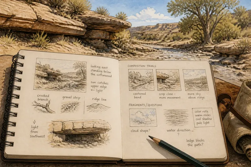
Begin with observable choices rather than a guess about what the work “should” look like. Look at the arrangement of forms, the scale of the view, the treatment of the surface, and the relation between people and their surroundings. These details give you a grounded way to compare works without forcing them into a single style.
- Viewpoint: Is the scene seen from a road, a doorway, a hill, or close to the ground? A viewpoint can make a place feel accessible, distant, enclosed, or exposed.
- Scale: Do people dominate the scene, or do buildings, landforms, and infrastructure take more space? Scale shifts the subject from individual experience to a wider environment, or back again.
- Surface: Are edges crisp, brushed, layered, or deliberately rough? Surface choices can direct attention and signal whether the artist favors description, mood, or visible process.
- Color and light: Are colors observed closely, simplified, intensified, or muted? Avoid assuming that a palette is a direct record of local weather; it may be an expressive decision.
- Omissions: What is outside the frame or left unpainted? The absence of a road, fence, shop, or person can matter as much as what appears.
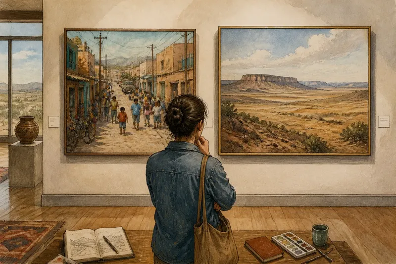
For instance, imagine a viewer comparing two works labeled “Southwestern.” One centers a crowded neighborhood street; the other shows a broad, nearly empty plateau. Rather than calling one more authentic, the viewer can compare viewpoint, signs of daily activity, and what each composition excludes. That approach reveals different ideas about place without pretending either image stands for the whole region.
How do artists shape a sense of place?
Artists shape place through more than subject matter. A tight crop can make a familiar building feel newly observed. A high viewpoint can expose patterns in roads or rooftops. Repeated marks may suggest wind, traffic, vegetation, or the uneven surface of a wall without rendering every detail.
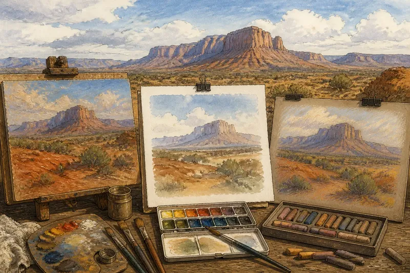
Materials matter, too, but they do not determine meaning on their own. A work on paper, canvas, wood, or another support may relate differently to touch and scale. The choice can come from practical needs, artistic preference, or a connection to a particular process. Read the material alongside the image rather than treating it as proof of a regional identity.
Communities also shape what becomes visible. Artists may respond to local work, family life, land stewardship, migration, or changes in a neighborhood. These concerns do not always announce themselves through a sweeping vista. Sometimes a storefront, a roadside sign, or a carefully painted domestic object carries more local meaning than a dramatic horizon.
How can you compare artworks fairly?
Compare works by asking the same focused questions, not by deciding which one best represents “the West.” What does each artist place at the center? What kind of attention does the composition invite? Which details seem observed, and which are transformed? Then consider how each answer changes your sense of the place.
Keep the artist’s stated identity and intention separate from what you infer by looking. A label or short biography can add context, but it cannot make a visual reading automatic. If a museum caption names a community, a location, or a material, use that information to guide further looking rather than to explain every mark.
You can also compare works across media or settings without treating one as the standard. A photograph and a painting of the same street may emphasize different relationships to time, cropping, and detail. The useful question is not which is more “Western,” but what each medium lets the artist make visible.
What questions help you look closer?
Is Western art the same as Western landscape art?
No. Landscape is one subject within a broader field that can include portraiture, still life, abstraction, public art, and scenes of daily life. Treating the region as scenery alone leaves out the people, interiors, and built environments that shape it.
Can an artwork belong to more than one region?
Yes. An artist’s connections may cross state, national, cultural, or geographic boundaries, and a work may refer to several places at once. A regional label can be a starting point, not an exclusive description.
Does a recognizable subject make a work stereotypical?
Not by itself. A mountain, horse, or open road can be used in familiar or unexpected ways; framing, detail, context, and the artist’s choices affect how the subject reads. Look for what the image does with a motif before judging it by the motif alone.
How should I use a broad museum label?
Use it to locate a group of works, then read individual captions and inspect the objects. Ask what the label connects and what it leaves unsaid. That small pause helps keep a category from becoming a substitute for attention.
What makes the label useful?
“Western art” is most useful when it opens a question about place rather than closes one. It can bring works into conversation, but their differences remain visible in subjects, viewpoints, materials, and relationships to community. The phrase works best as a doorway, not a verdict.
The next time you encounter the label, choose one specific detail to follow: a road disappearing beyond the frame, a painted sign, a cluster of homes, or the edge where built space meets land. Let that detail lead you toward the artist’s choices and the place’s particularities. This is how the West is not one visual style becomes more than a correction; it becomes a sharper way to look.